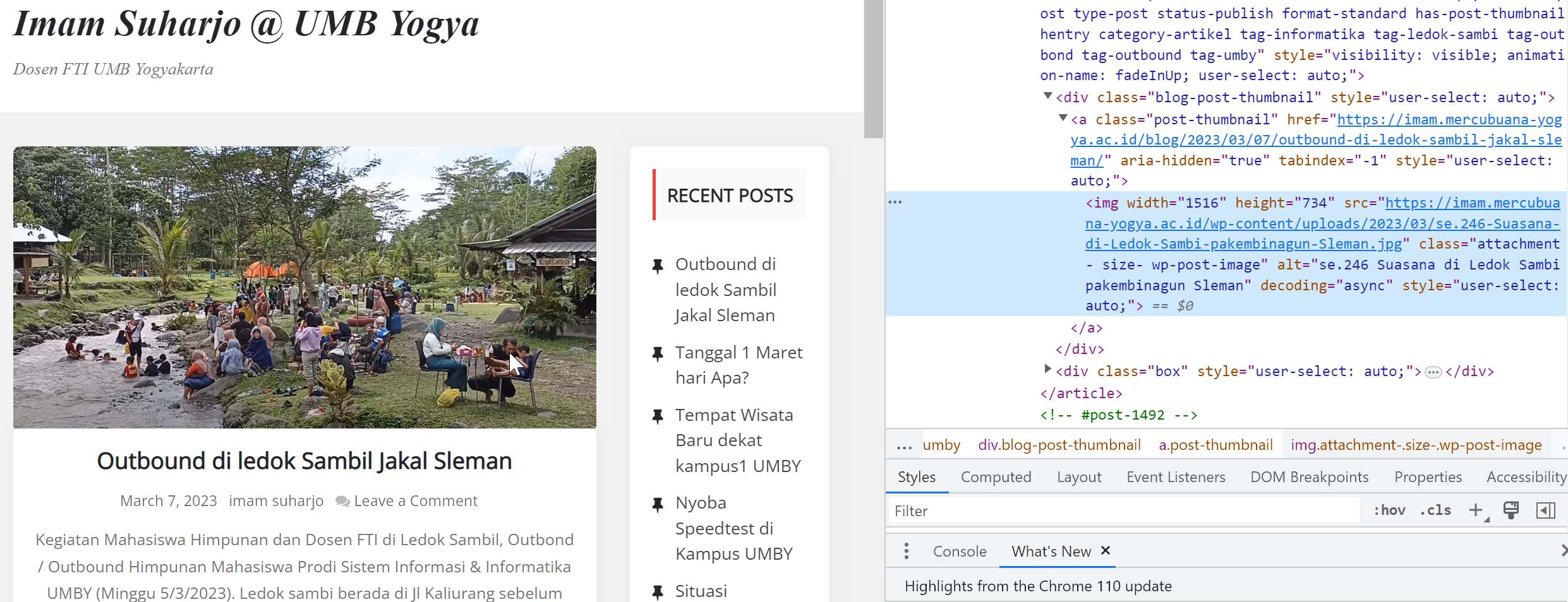
About srcset is an HTML attribute that allows you to provide multiple versions of an image, each with different resolutions or sizes, and the browser can choose the appropriate version to display based on the user’s device and screen size.
WordPress is a popular content management system that powers millions of websites around the world. WordPress makes it easy to add srcset attributes to images by providing built-in support for responsive images.
When you upload an image to WordPress, it automatically generates multiple sizes of the image based on your site’s settings. These different sizes are then used in the srcset attribute to provide multiple versions of the image.
You can also use plugins like Jetpack, WP Retina 2x, and many others to enhance WordPress’s built-in responsive image functionality and provide even more control over how images are displayed on your website.
